Not everything needs to be memorable
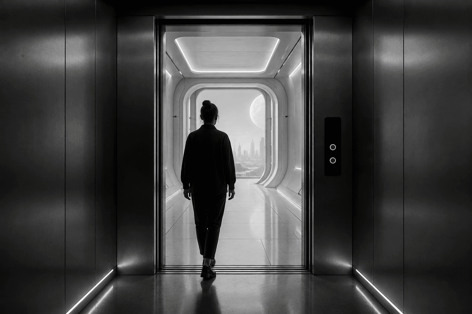
There are products we use for years without remembering a single interaction.
Take an elevator.
You walk in, press a button, wait for a few seconds, arrive at your floor and leave. You rarely think about the interface. You probably do not remember the typography, the sound of the button or the exact position of the controls.
And that might be precisely why it works.
The elevator has no ambition to become the most interesting part of your day. It understands its role in your life and gets out of the way.
I find that increasingly interesting because so much of digital product design seems to be moving in the opposite direction.
We design moments.
We optimise engagement.
We add recommendations, onboarding sequences, animations, notifications, celebrations, personality and microinteractions. We talk about delight and memorability as if every interaction between a person and a product deserves to become an experience.
But perhaps some of the best experiences are the ones we barely notice.
The strange obsession with being remembered
For years, product design has borrowed heavily from branding.
This makes sense. Products live in competitive markets, and differentiation matters. A distinctive voice, visual language or interaction can make a product recognisable and, in some cases, genuinely enjoyable.
The problem begins when distinctiveness becomes a requirement for every single moment.
Not every action needs personality.
When I am paying an electricity bill, I do not need to be delighted. When I am changing a password, I am not looking for entertainment. If I am booking a medical appointment, the product does not need to surprise me.
In those situations, the product is not the destination.
It is infrastructure.
And infrastructure has a very different relationship with attention.
The best infrastructure often becomes invisible.
We notice the Wi-Fi when it stops working. We think about electricity when there is a power cut. We become extremely aware of an elevator when the button does nothing.
But when these systems work well, they quietly support whatever we were actually trying to do.
Digital products do not always give themselves that permission.
Sometimes they seem afraid of disappearing.
Attention is not free
Perhaps this happens because attention became one of the easiest things to measure.
Sessions.
Time spent.
Page views.
Interactions.
Retention.
Notifications opened.
Screens visited.
When the numbers go up, the product appears healthier.
But a person's attention is not an unlimited resource, and consuming more of it is not necessarily evidence that we have created more value.
If it takes me fifteen seconds to accomplish something that used to take five, my “time spent” has increased by 200%.
That would be an excellent metric if we forgot to ask why.
The same ambiguity appears everywhere.
A user exploring ten pages might be highly engaged. Or completely lost.
Someone returning to an app four times in one afternoon might love it. Or they might have failed to complete the task the previous three times.
More interaction is not automatically better interaction.
Sometimes the most respectful product decision is to require less.
The elevator test
I sometimes think about this as an informal design question:
Could this interaction behave more like an elevator?
Not visually, of course.
An elevator is interesting because the relationship between intention and action is extremely clear.
I know what I want: floor seven.
The system gives me a simple way to communicate it.
I receive enough feedback to know that the request has been registered.
Then the interface effectively disappears until I need it again.
There is no onboarding tutorial explaining how elevators work. No notification asking whether I am enjoying the journey. No recommendation to visit floor eight because people similar to me also enjoyed it.
The experience is almost aggressively uneventful.
And that is perfect.
Of course, digital products are more complex. An ecommerce platform, a banking application or a productivity tool cannot be reduced to a row of buttons.
But the principle still matters.
How much of the interface exists because the user needs it, and how much exists because the product wants to be noticed?
That distinction is becoming increasingly important.
Good design can remove itself
One of the contradictions of design is that visible work is much easier to appreciate than invisible work.
Add a new component and everyone can see it.
Remove three unnecessary steps and the result looks like… almost nothing happened.
Simplify navigation and the user may never know how complicated the previous version was.
Rewrite a confusing flow so that nobody needs help and the support ticket that never gets created will never appear in a presentation.
Some of the best design outcomes leave surprisingly little evidence of the work that produced them.
Maybe that is part of why we keep adding things.
Addition is visible.
Restraint is harder to demonstrate.
Yet restraint is often where judgement becomes most valuable.
Knowing what not to introduce.
Knowing when an animation contributes nothing.
Knowing that another recommendation is unnecessary.
Knowing that a user has already achieved what they came to do and does not need to be kept around.
These decisions are not the absence of design.
They are design.
There is a difference between delight and relief
We often talk about delight as a desirable outcome.
And sometimes it absolutely is.
A beautifully crafted animation, a clever detail or an unexpected moment of personality can turn an ordinary interaction into something special.
But there is another positive emotion that perhaps gets less attention:
relief.
The payment worked.
The document uploaded.
The booking is confirmed.
The form remembered my information.
I found what I needed immediately.
Nothing spectacular happened.
Nothing needed to.
Relief is especially important in products people use because they have to, rather than because they want to.
Government services. Banking. Healthcare. Administration. Internal enterprise tools.
In these contexts, “boring” can be a remarkably ambitious design goal.
Boring can mean predictable.
Predictable can mean trustworthy.
And trustworthy can be far more valuable than memorable.
Designing products that know when to leave
None of this means that products should have no character.
The best products often have incredibly strong identities.
The question is where that identity belongs.
There is a difference between creating a product people recognise and making every interaction compete for their attention.
A confident product does not need to prove its personality constantly.
Sometimes the most sophisticated thing an interface can do is recognise that the user has somewhere else to be.
Help them.
Give them confidence that the task is complete.
Then disappear.
The elevator does this beautifully.
It does not ask to become part of your story.
It simply gets you where you wanted to go.
And perhaps there is a useful lesson hidden in that very ordinary interaction:
Not every product needs to be memorable. Some just need to avoid becoming something the user has to think about.
date published
Aug 31, 2026
reading time
8 min read


