The most respectful button on Netflix
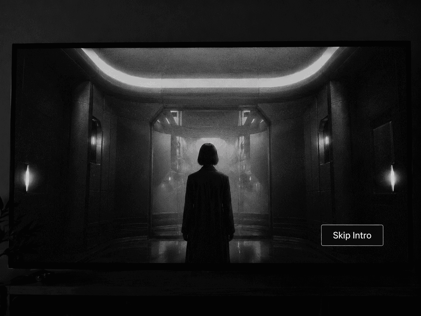
There is a button on Netflix that I find much more interesting than it first appears: Skip Intro.
At a purely functional level, there is nothing remarkable about it. It appears for a few seconds, lets you bypass the opening sequence and disappears. But the more I think about that small interaction, the more it feels like a good example of something digital products often struggle with: understanding that not every second of a user’s attention needs to belong to them.
An opening sequence is not disposable content. Someone designed it, edited it, composed the music, chose the imagery and decided how the story should begin. In some cases, an intro becomes part of the identity of a series itself. And yet Netflix deliberately gives us the option to ignore all of that.
What makes the decision interesting is not that the intro lacks value. It is that its value changes with repetition. The first time I watch a series, I may want to experience the whole thing. By episode six, I probably know exactly what is coming. The product recognises that the context has changed and adapts accordingly.
That sounds obvious, but many products do the opposite.
A huge part of digital design is built around attracting and retaining attention. We want people to open the app, click the notification, explore another page, watch another video, read another recommendation or stay a little longer. There are obvious business reasons for that, and in many cases engagement genuinely matters. The problem starts when we stop questioning the assumption that more attention always means more value.
It does not.
A person spending more time inside a product may be deeply engaged, or they may simply be lost. An extra click can be a sign of curiosity, or a symptom of confusion. A longer session can indicate interest, or friction. The metric itself rarely tells us which story is true.
This is why I like Skip Intro. It quietly acknowledges that the fact we created something does not mean the user owes it their attention.
That idea goes far beyond streaming. A team may spend weeks designing a beautiful onboarding flow, but an experienced user may want to skip it entirely. A banking app may want to promote a new product before showing the account balance, while the customer simply wants to check whether a payment arrived. An ecommerce platform may see the confirmation page as another opportunity to recommend products, while the customer just wants to know that the order went through.
From the company’s perspective, these are opportunities. From the user’s perspective, they can easily become interruptions.
We often talk about friction as if it were synonymous with complexity: too many steps, confusing navigation, a form that asks for too much information. But there is another kind of friction that is much easier to overlook. It happens when something is perfectly usable and still gets in the way.
A modal can be beautifully designed and still be badly timed. A recommendation can be relevant and still be unnecessary. A notification can be clear and still be unwanted. In those cases, the problem is not usability. It is that the product is asking for attention at the wrong moment.
Repetition makes this even more complicated.
Design teams often evaluate interfaces as individual moments. We ask whether a screen is clear, whether the hierarchy works or whether the CTA is visible enough. But many products are not used once. They are used every day, sometimes hundreds or thousands of times over several years.
That changes things.
An onboarding message may be useful the first time and irritating the tenth. A confirmation dialog may create confidence initially and feel like an obstacle once the behaviour becomes familiar. A recommendation can be helpful until the product starts making the same suggestion over and over again.
Something can be well designed in isolation and still become exhausting through repetition.
In that sense, Skip Intro is not really about skipping content. It is about designing for familiarity. Netflix understands that the relationship between a user and a product changes over time, and that a good experience should be allowed to change with it.
There is also a measurement problem here. Most of the things we track are visible actions: clicks, sessions, views, time spent, conversions. Respecting someone’s time often produces less of all of them. The user completes the task faster, visits fewer screens and leaves sooner.
On a dashboard, that can look suspiciously similar to disengagement.
Imagine that it takes someone ten minutes to find an invoice inside an app. Their session duration looks excellent. If we redesign the flow and they find it in twenty seconds, the metric collapses. The product, however, has become dramatically better.
This is why I think we need to distinguish between attention we have earned and attention we have captured.
The first is valuable because the user chooses to give it. The second can simply mean we made leaving unnecessarily difficult.
There is something quite confident about a product that knows the difference.
Netflix could force every opening sequence to play. It could treat those forty-five seconds as part of the experience that users are expected to consume. Instead, it gives people a very small escape hatch and effectively says: we know why you are here, and this part may no longer be useful to you.
That is a surprisingly respectful design decision.
Products often behave as if every available moment needs to be filled. Empty states need content. Completed tasks need another recommendation. Pauses become opportunities to redirect attention. Even success messages frequently try to lead us somewhere else.
But sometimes the best next step is no next step at all.
Sometimes the task is finished.
A good payment flow eventually lets you stop thinking about payments. A good navigation app gets you to your destination and becomes irrelevant. A good productivity tool helps you complete the work so that you can return to whatever mattered outside the tool.
Perhaps that is one of the most useful ideas hidden inside such an ordinary button.
A product does not always succeed by making us want to stay.
Sometimes it succeeds by understanding when we are ready to leave.
And the next time Skip Intro appears, I probably will not think about any of this. I will press it and continue watching.
Which is probably exactly the point.
date published
Jul 21, 2026
reading time
5 min read


