Gadis — reducing friction in everyday grocery shopping
A mobile-first grocery experience focused on habit, speed, and reducing cognitive load.
problem
Grocery shopping isn’t exploration. It’s repetition. Users return to buy the same products, following predictable patterns. Yet many experiences treat every visit as new, forcing users to search, browse, and rebuild their cart. This introduces friction in a process that should be fast and efficient. When repetition isn’t optimized, time is lost — and so is conversion.
solution
Design for fast repetition. The experience prioritizes quick access to frequently purchased products, reducing the need to search or rebuild the cart. By leveraging user history, the system surfaces relevant items upfront, streamlining navigation and shortening the path to purchase. Less browsing, fewer decisions, faster checkout. A flow optimized for speed, efficiency, and higher conversion.
Context
Online grocery shopping has become a regular habit for many users, especially for recurring weekly purchases.
While physical stores are optimized for speed and familiarity, digital experiences often fail to replicate this efficiency.
Most supermarket apps prioritize browsing and product discovery, instead of supporting fast, repetitive shopping behaviors.
User Insight
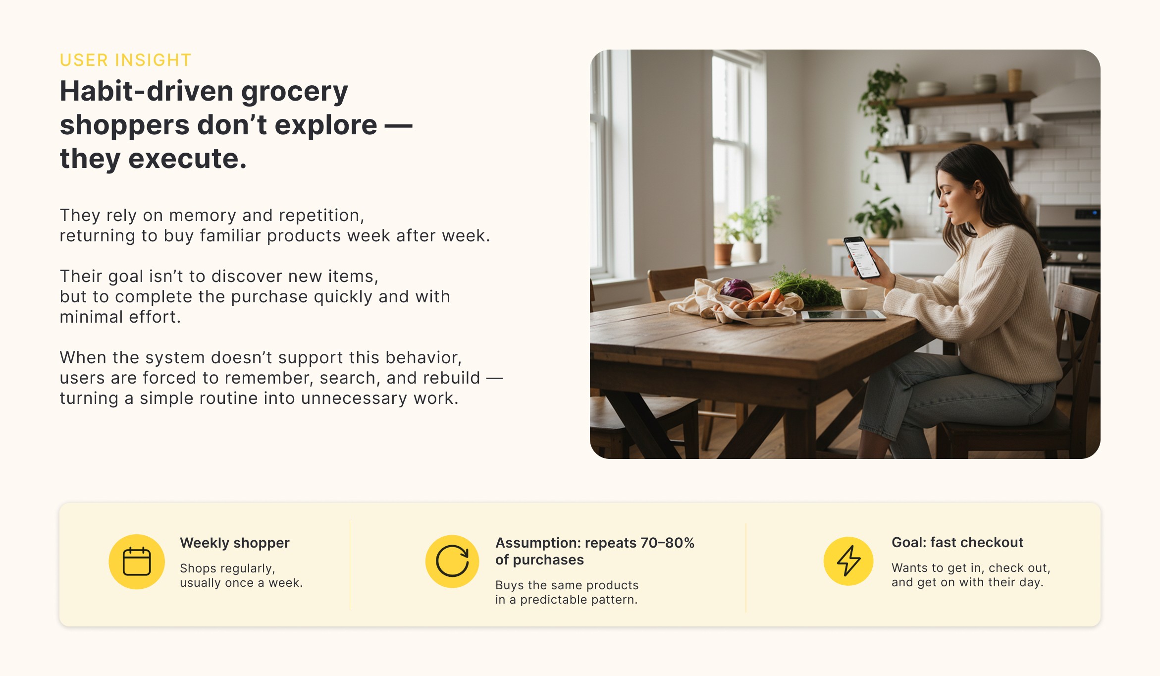
They rely on memory and repetition, returning to buy the same products week after week.
Their goal isn’t to discover new items, but to complete their purchase as quickly as possible.
Speed, predictability, and low effort define a good experience.
When the system doesn’t support this behavior, users are forced to remember, search, and rebuild —
turning a simple routine into unnecessary work.
Current experience
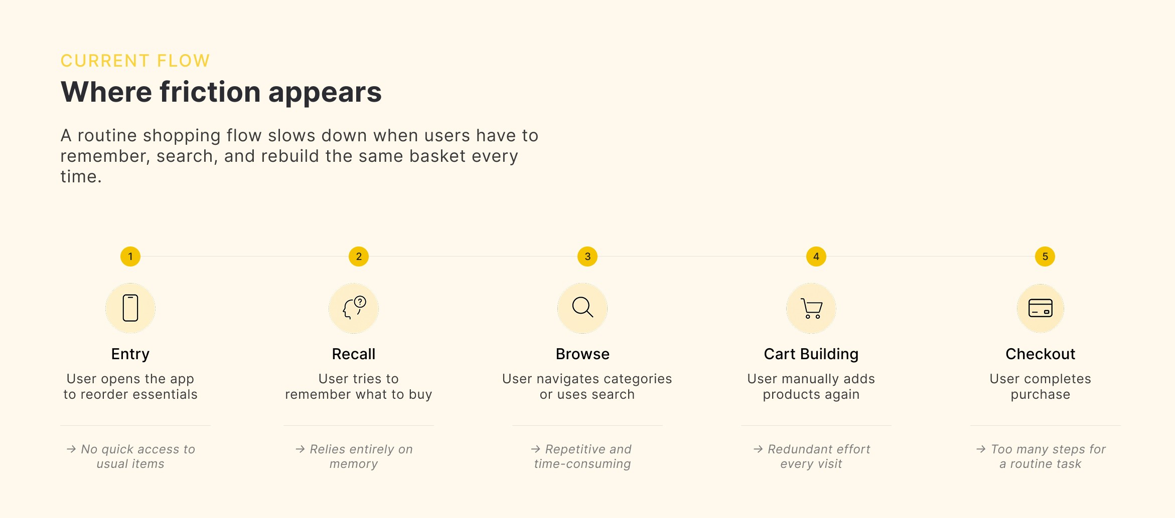
The experience doesn’t match how users actually shop.
Instead of supporting quick, repetitive purchases, it forces users to rebuild their cart from scratch every time.
What should feel automatic becomes a sequence of small decisions — searching, navigating, and remembering.
A routine task turns into unnecessary effort.
Key insight
Users don’t want to browse.
They want to reorder.
Design Principles
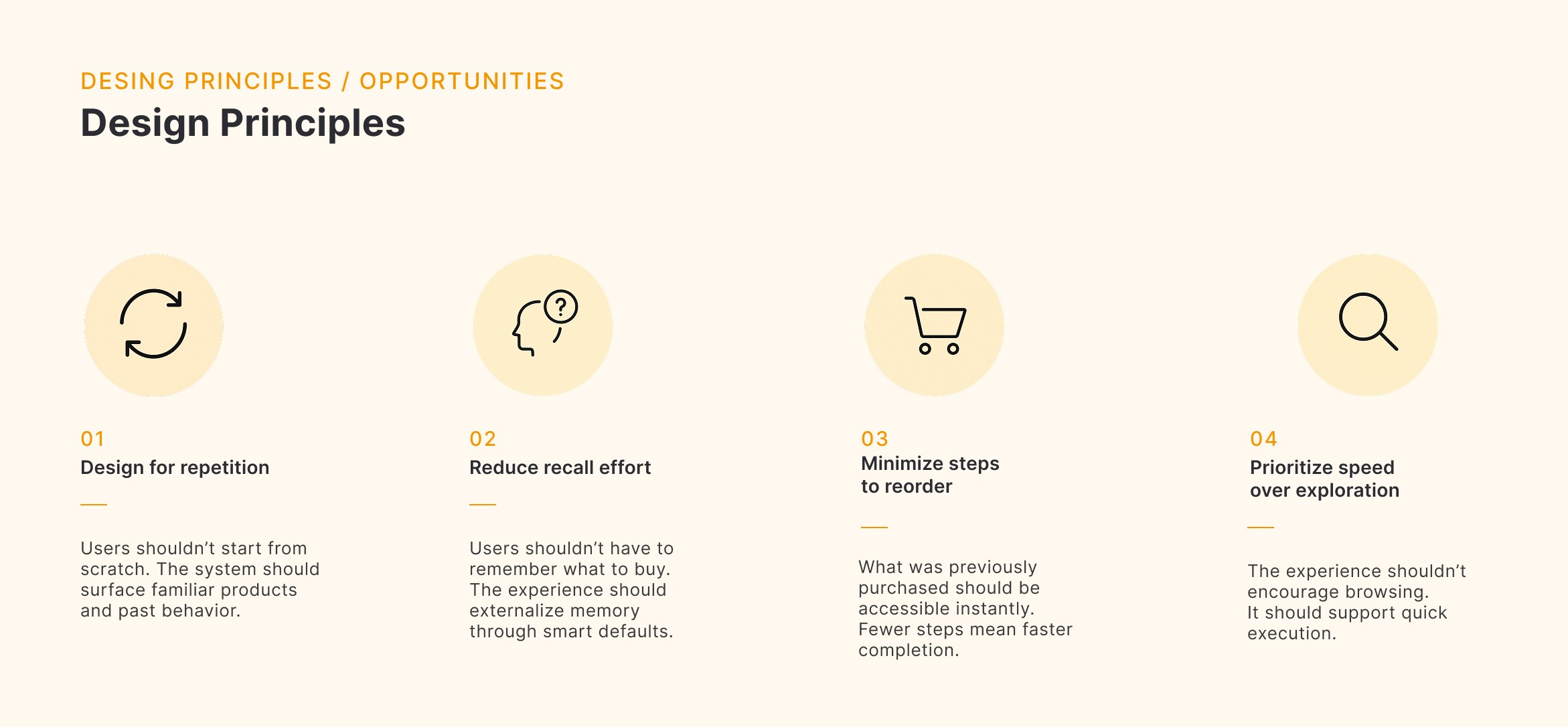
The experience should be built around how users actually shop — prioritizing repetition, speed, and minimal effort.
Product direction
Designing for fast, repeatable shopping.
The experience shifts from browsing to execution — reducing friction and enabling users to complete their purchase with minimal effort.
By surfacing familiar products and past behavior, the system shortens the path to checkout.
Less effort.
Faster completion.
Higher conversion.

Features / Key decisions
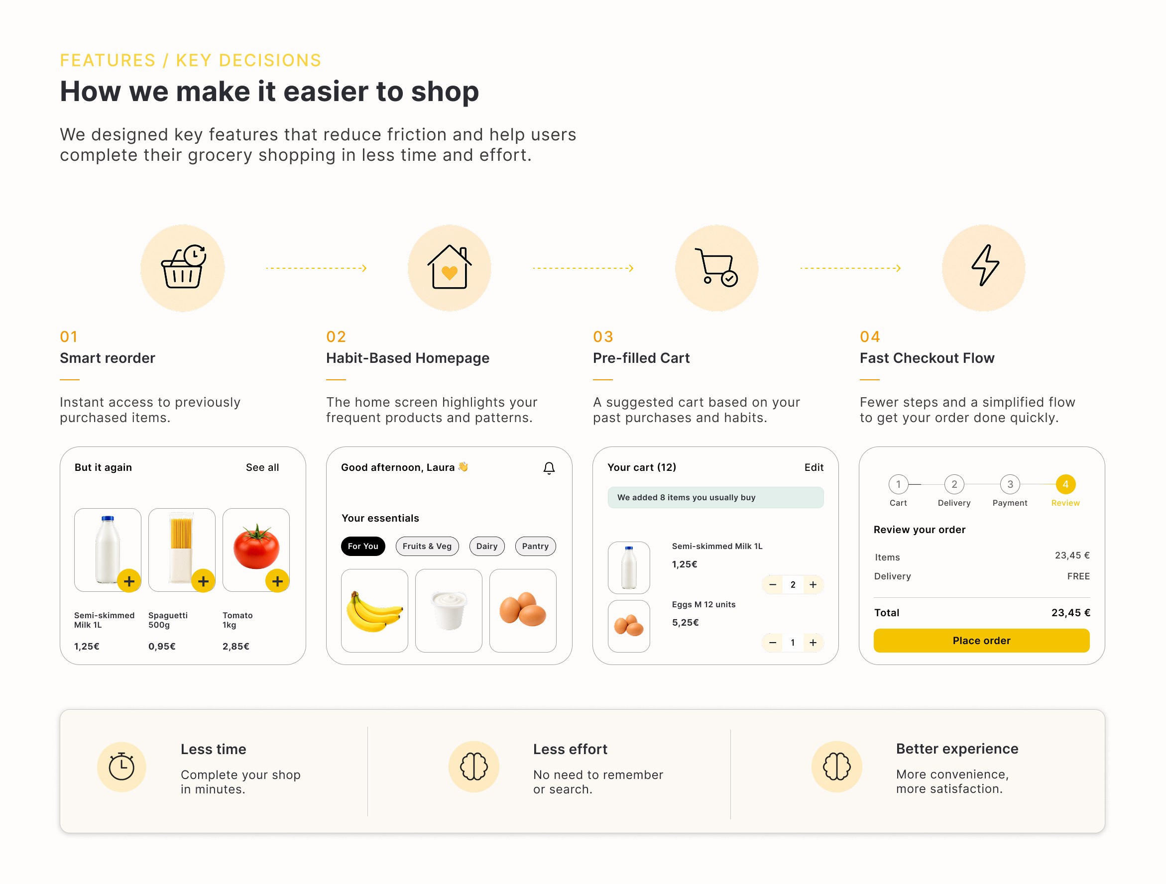
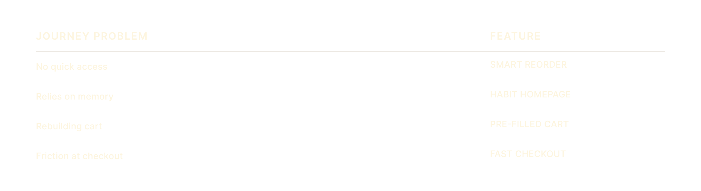
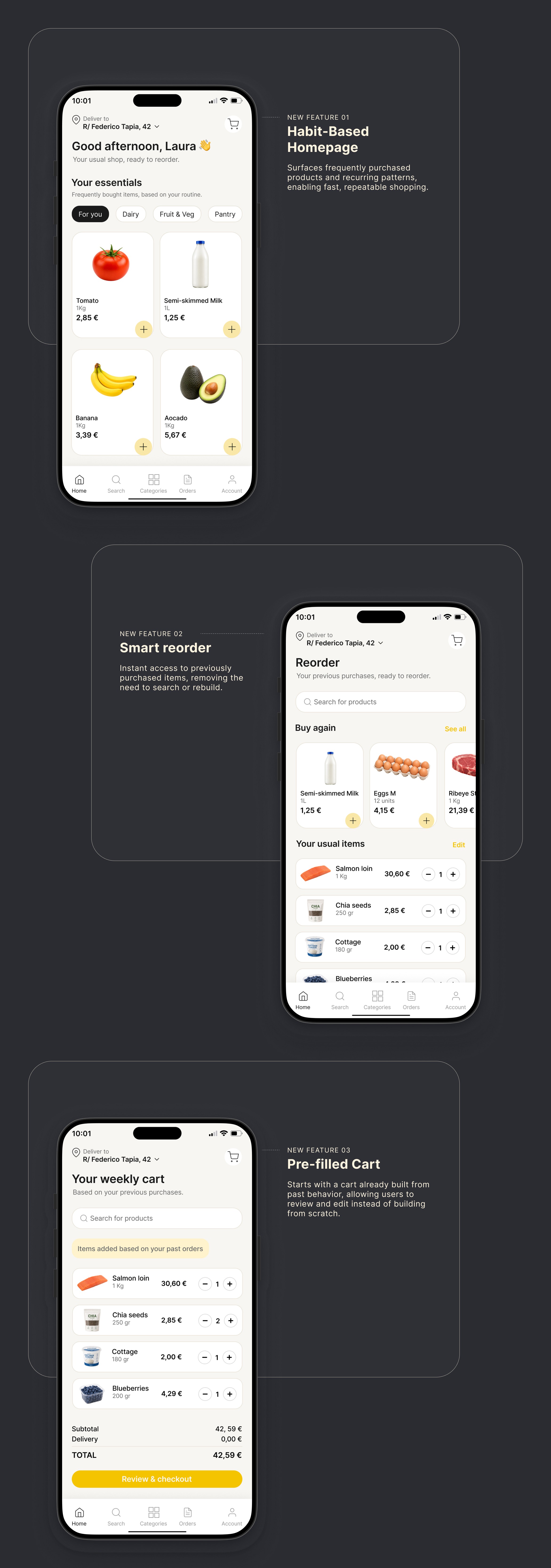
SMART REORDER
Instant access to previously purchased items — no need to search or rebuild.
→ Eliminates search friction and reduces effort
HABIT-BASED HOMEPAGE
The home screen surfaces frequently bought products and recurring patterns.
→ Reduces reliance on memory
PRE-FILLED CART
The system suggests a starting cart based on past behavior.
→ Removes the need to start from scratch
FAST CHECKOUT
A simplified flow with fewer steps to complete the purchase quickly.
→ Speeds up completion and reduces drop-off
UI SCREENS

What this project highlights
Designing for repetition, not exploration
Most grocery interactions are habitual. Prioritizing familiarity reduces friction.
Reducing cognitive load in everyday tasks
Removing unnecessary decisions allows users to complete purchases faster.
Turning behavior into product decisions
Past actions become the foundation of the experience.
Potencial impact
Faster checkout completion
Reduced drop-off in cart
Increased repeat purchase rate
year
2025
timeframe
1 week
tools
Figma
category
UI/UX