Piscine Direct Usine PDU — turning a dated catalogue into a digital sales channel
A brand and ecommerce redesign focused on making a complex, high-consideration purchase easier to understand — from product discovery to indicative pricing and qualified leads.
problem
PDU’s previous website no longer reflected the scale or ambition of the business. The catalogue lacked hierarchy, the visual language felt dated, and customers had little support in understanding what a pool project might involve before contacting the sales team. For a high-consideration purchase, that created friction precisely where clarity, trust and price understanding mattered most.
solution
I redesigned the brand and digital journey around a clearer commercial flow, combining a more credible visual identity with better product discovery and an online pricing tool. The new approach helped users understand the offer, narrow down their options and estimate their project before contacting the sales team, turning the website into a more useful lead-generation channel.
Context
I redesigned the brand and digital journey around a clearer commercial flow, combining stronger product discovery with a guided pricing experience. The aim was to help users understand the offer, narrow down their options and estimate their project before reaching the sales team — making the website a more useful part of the sales process.
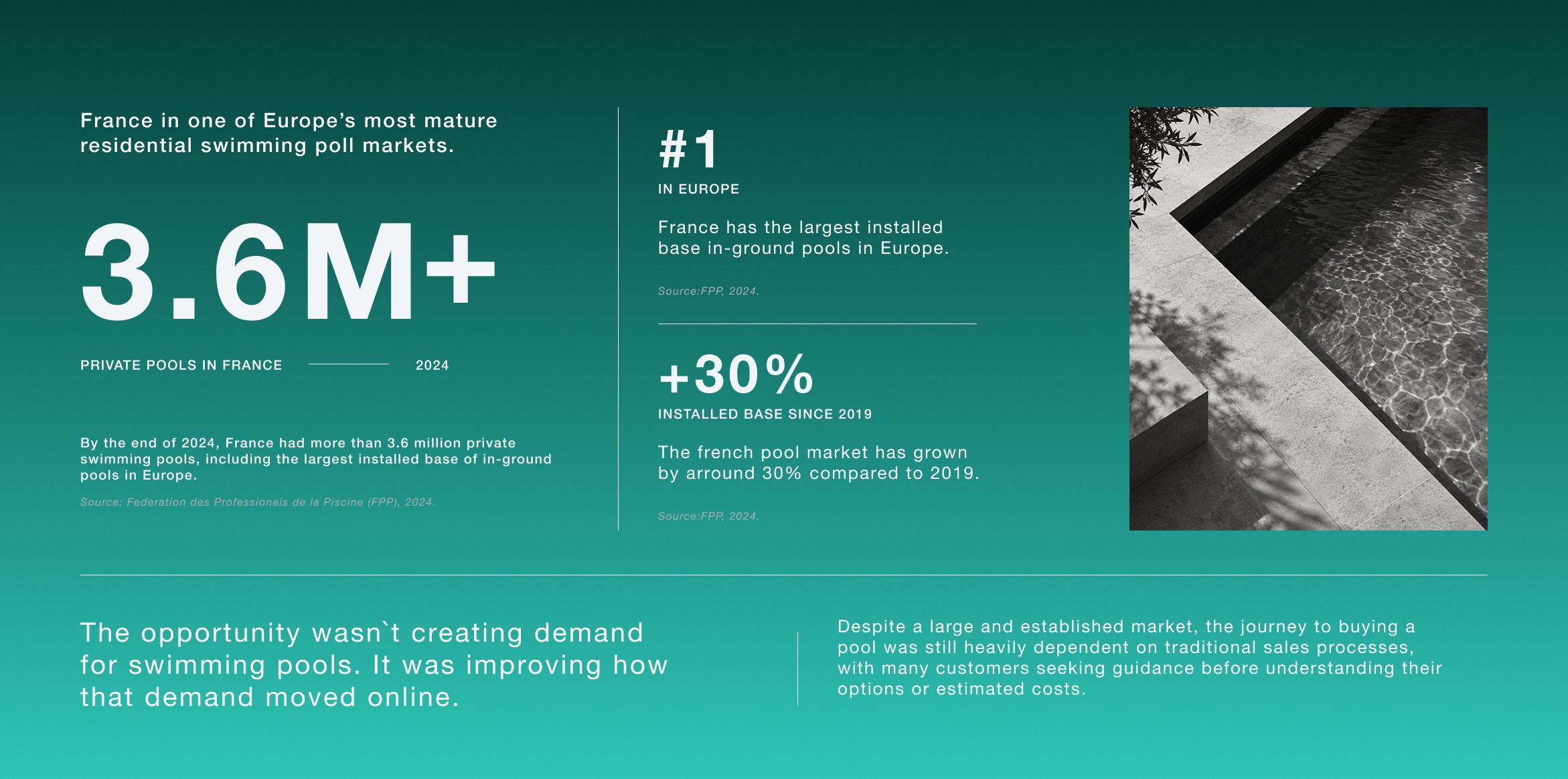
The website had to do more than look better
PDU needed more than a visual refresh. The opportunity was to make the website useful earlier in the buying journey — helping customers understand the offer, frame their project and move forward with more confidence before speaking to the sales team.
It was about making the website more useful before the first conversation ever happened.
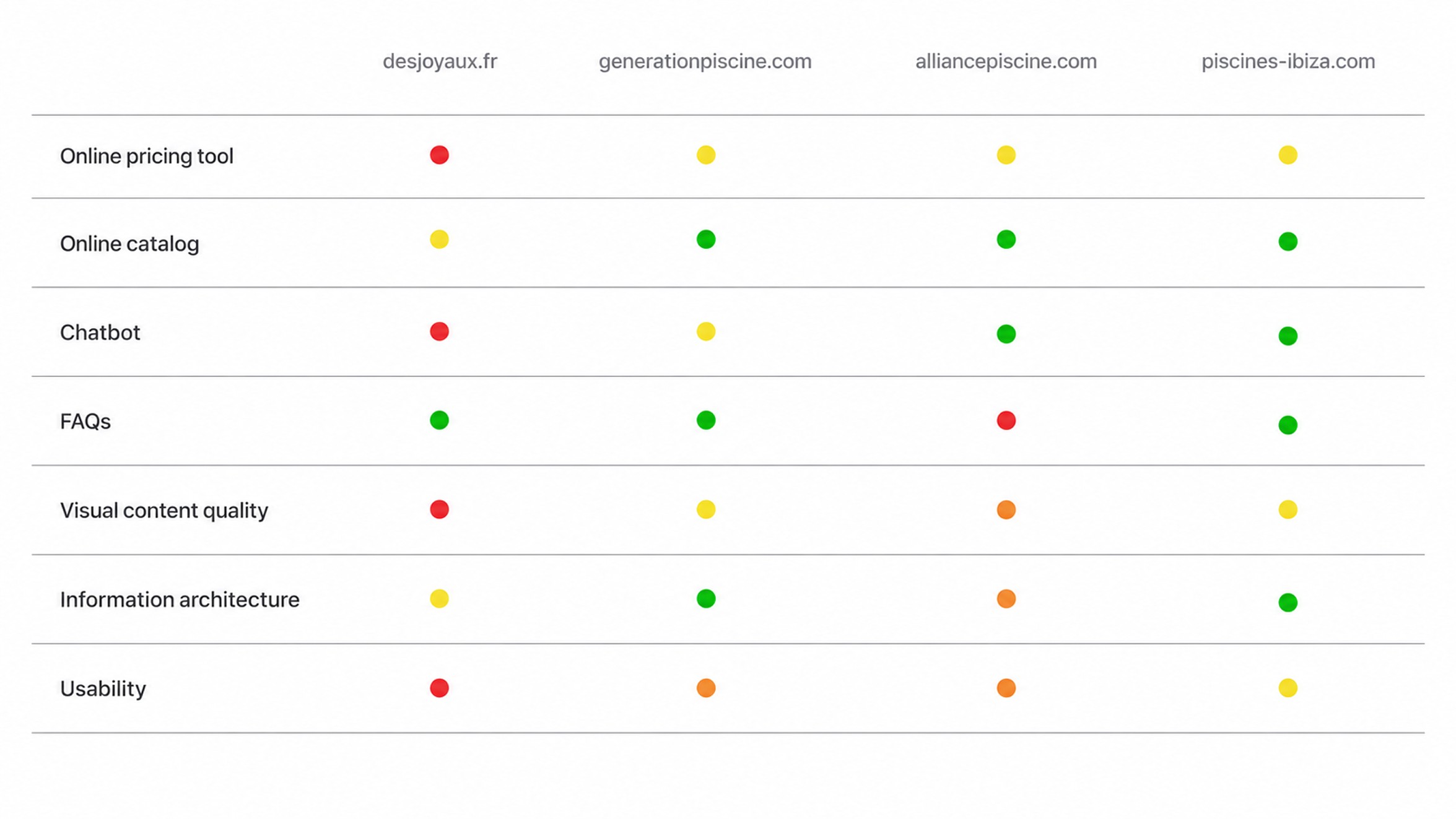
Price was the missing piece
A review of the market showed that most competitors already covered the basics: product catalogues, supporting content and some form of guidance.
What remained difficult to understand online was price.
For customers, cost is one of the earliest and most decisive questions in a high-consideration purchase. Yet in this category, that answer was still largely locked behind a sales conversation.
That gap revealed the opportunity: bring pricing earlier into the journey through a guided digital experience.
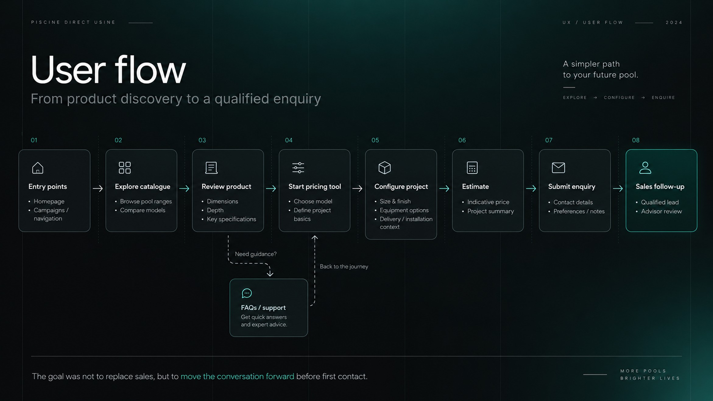
A pool is not a SKU
Unlike a conventional ecommerce product, a pool is defined by a combination of dimensions, materials, installation requirements and optional equipment. Price only becomes meaningful once those variables start to come together.
The challenge was therefore not to display more information, but to structure the right decisions in the right order.
The goal was to turn a technically complex configuration into a journey that felt understandable and progressive.
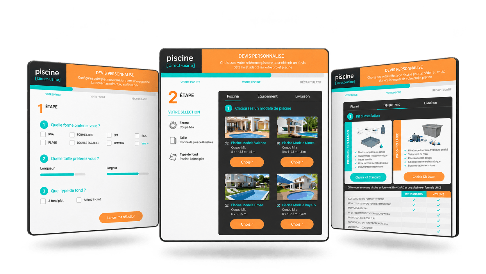
From broad criteria to a concrete configuration
The flow moved from broad project criteria to more specific technical decisions, helping users build a clearer picture of their pool progressively.
Each step reduced the number of open choices and brought the configuration closer to an indicative price.
Rather than exposing the full complexity at once, the journey revealed it only when it became relevant.
Designing the pricing flow
The pricing experience needed to provide value without asking users to complete a long or overly technical configuration.
I structured the flow so that each decision progressively refined the estimate, while keeping the experience lightweight enough to maintain momentum.
The objective was not to produce a final quote, but to give users enough clarity to understand the scale of their project and continue with greater confidence.
Progressive disclosure over technical overload
Rather than exposing every possible variable at once, the experience introduced complexity progressively. Users could make the decisions that mattered at each stage, while secondary technical details remained contextual and manageable.
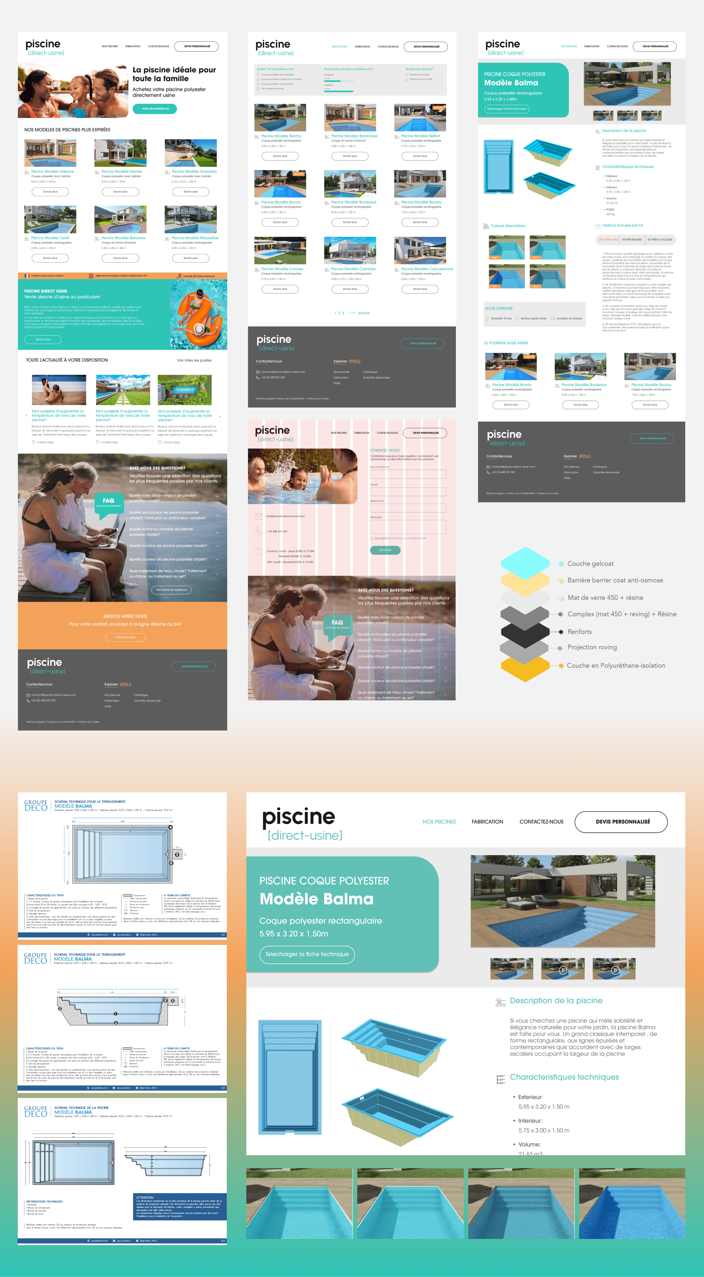
Then the interface had to carry that clarity
Once the journey was defined, the challenge was to make that structure visible in the interface.
The catalogue, product pages and pricing flow needed to handle a large amount of information without feeling dense or difficult to navigate.
I used hierarchy, progressive disclosure and a more contemporary visual language to make the experience easier to scan, understand and trust.
The interface was designed not as a brochure, but as a commercial tool that helped users move forward with greater confidence.
From broad criteria to a concrete configuration
The flow moved from broad project criteria to more specific technical decisions, allowing users to build a clearer picture of their pool progressively.
Each step reduced the number of open choices and brought the configuration closer to an indicative price.
Rather than exposing the full complexity at once, the journey revealed it only when it became relevant.
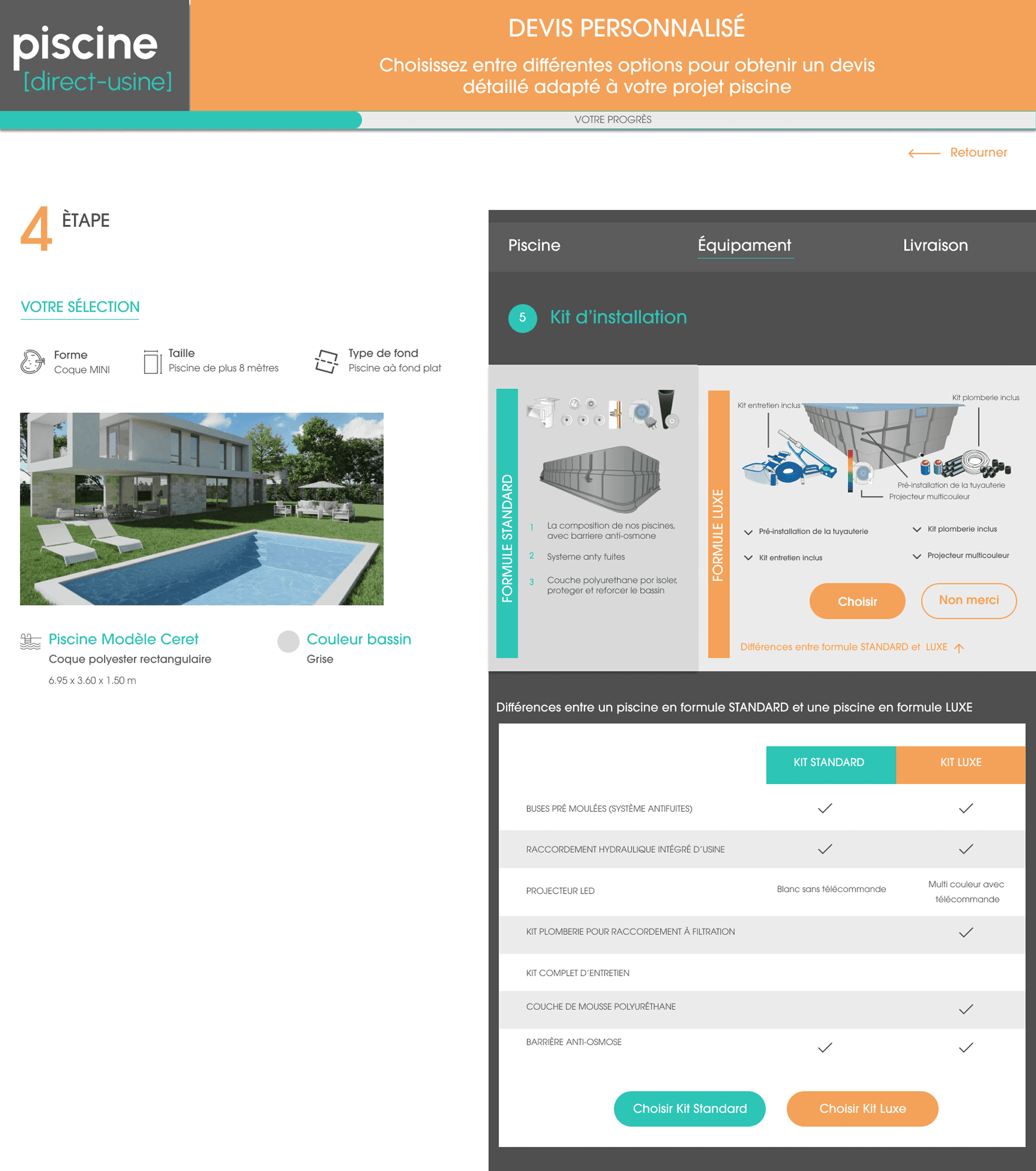
Turning technical choices into understandable decisions
One of the hardest parts of the flow was translating technical installation choices into something customers could actually compare.
The available kits affected equipment, preparation and the scope of the project, but presenting them as raw specifications would have made the decision harder.
The interface therefore focused on making the trade-offs visible at a glance, helping users understand what each option included before moving forward.
The goal was not to simplify the product, but to simplify the decision.
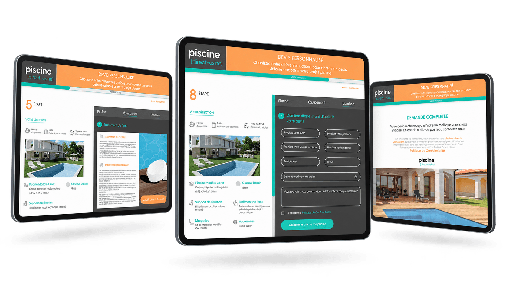
Detail without losing the journey
Some decisions required more context than a simple label or specification could provide.
Additional information was surfaced within the flow itself, allowing users to compare options and review technical details without leaving the journey.
The final steps then brought those decisions together into a structured quotation request.
Enough detail to support the decision, without breaking the flow.
Outcome
The project reframed PDU’s website from a digital catalogue into a more useful part of the sales journey.
By combining clearer product discovery with guided configuration and indicative pricing, the experience helped users understand the offer, define their project and reach the sales conversation with more context.
Although I did not have access to post-launch analytics, the impact was structural: the website became a more active commercial tool, supporting customers before the first conversation with the sales team.
The website and pricing tool were developed after my involvement ended, so I do not attribute post-launch performance to the work shown here.
The value of the project was not only in improving the interface, but in making the digital channel more useful within the buying process.
year
2024
timeframe
3 months
tools
Figma · FigJam · Adobe Creative Suite
category
UI/UX